The Problem
Based on studies from our client, smokers were not sticking to their 12-week program in order to stop smoking. Our task was to devise an innovative way to motivate smokers to keep taking their smoking cessation medication.
The Idea
Our solution was to create an app that allowed smokers to receive immediate support from their friends and family while trying to reach their goals.
My Role
I led the creative and design team, provide UX guidance, strategy, visual design and facilitate workshops with stakeholders.
Together with UX leads, strategists, art directors, designers, and copywriters, we defined the ideas, started initial designs, tested and implemented along with the dev team.
Additionally, I was responsible for implementing an agile methodology to a waterfall environment.
Discovery
Understanding users
The market is flooded with quitting apps and programs, so our app had to be different and most of all, effective. We realized that the emotional aspect of including loved ones in the smoker’s journey to quit smoking would ultimately push the smoker to stay on track. This conclusion came about after we did a few workshops with the client and we obtained the information we needed to create personas.
We created “Quitter” as well as “Supporter” personas that reflected the research regarding the concern for loved ones who smoked. It was their desire to help their friends and family to stop smoking as well as to comfort them by quitting. This would keep both the Quitter and Supporter engaged in the process until a successful cessation.
Research & Discovery
Personas
After creating user stories and considering everything that went into informing those stories, personas were made to help us understand our user's context, behavioral patterns, needs and pain points.
I started the conversation with the interviewees. Using the data extracted from the interviews, I constructed the archetypes myself. Then I collaborated with my team on refining the personas throughout the process as we gathered more data.
Based on their responses, I was able to create the personas, empathy maps, and user journeys to fill in the business canvases and help us figure out how to turn ideas into a viable business model.
Define
Features map
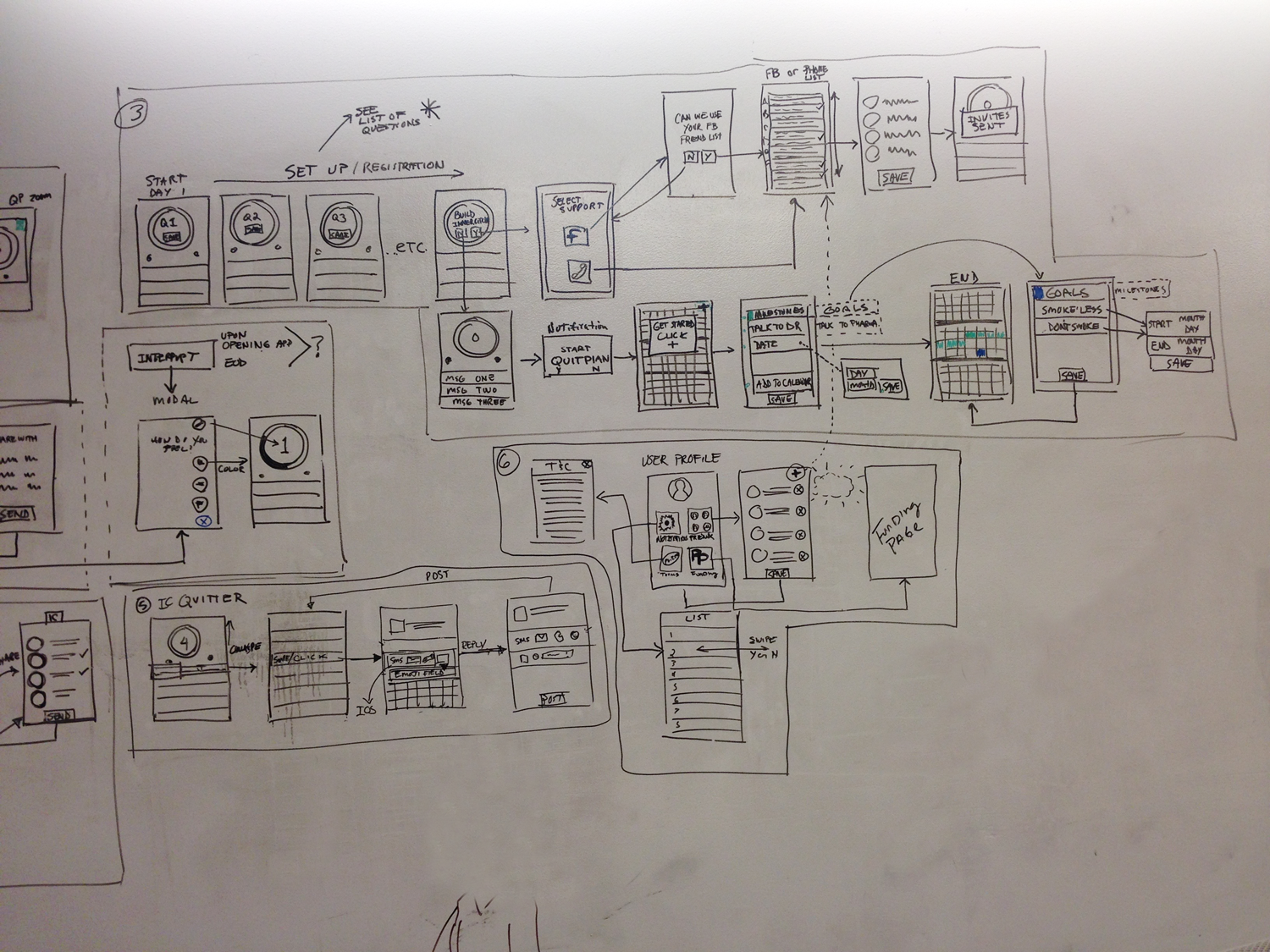
User flows App map, registration, schedule, main interaction


Ideate
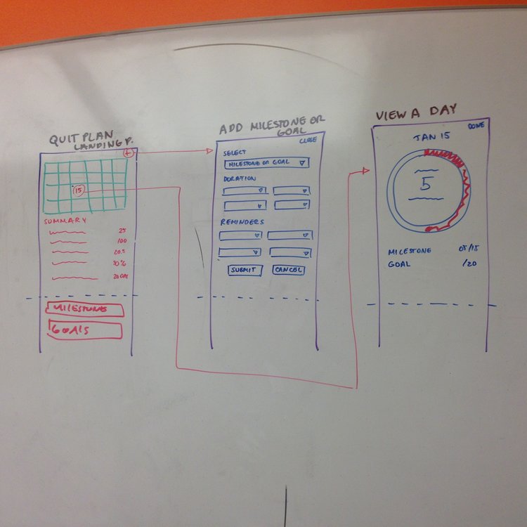
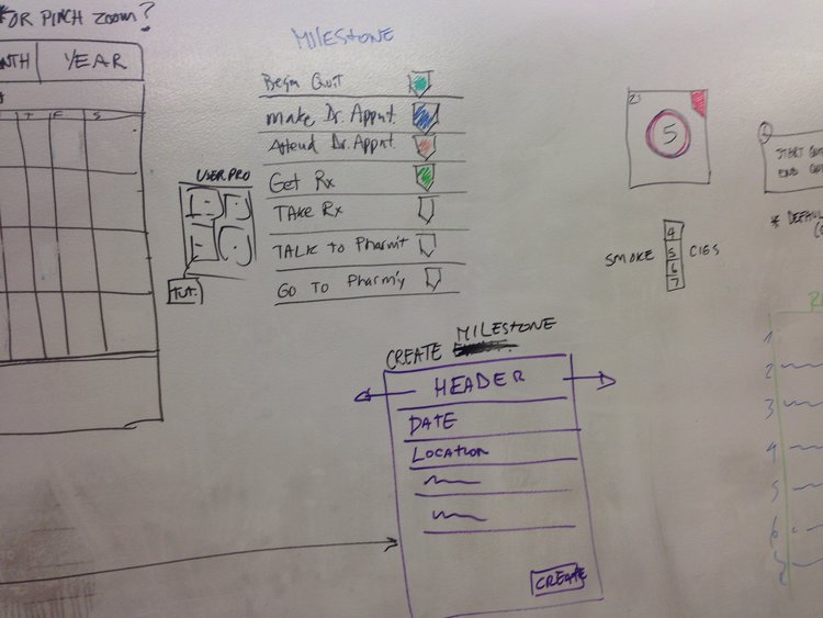
Many sessions, a lot of whiteboards...


Design
Primary visual designs
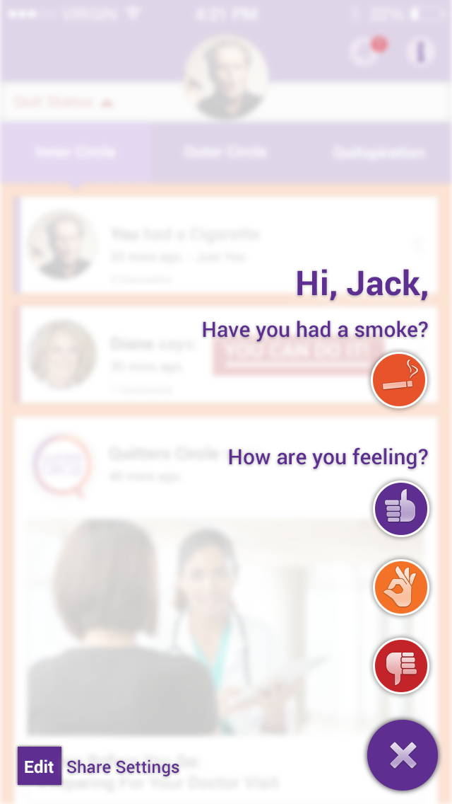
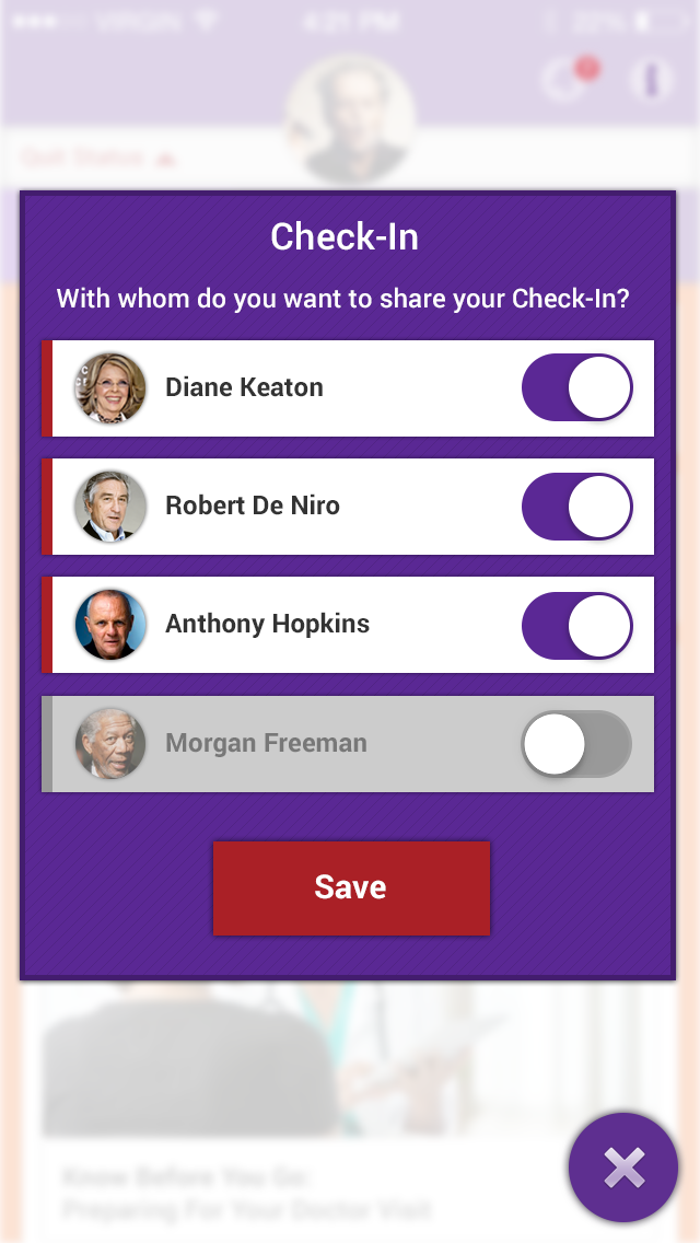
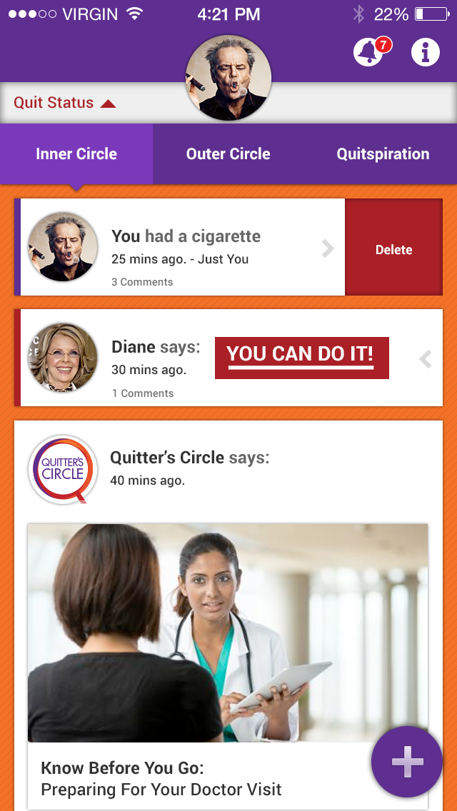
One of the significant aspects of this project was the fact that we were clear on the design directions from the beginning. We prioritized three important features:
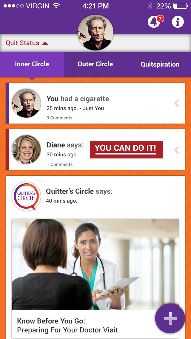
- Inner Circle
- Mood tracker and cigarette counter
- Calendar to help smokers organize their days and visits to doctors
- Quit plan that would help them remain focused on their milestones as well as short and long term goals
To obtain both conceptual and usability feedback, we tested using a mix of paper and Axure prototypes. In two rounds of tests, we tried over a dozen concepts, with the most interesting ones presented here:
Inner Circle Flow
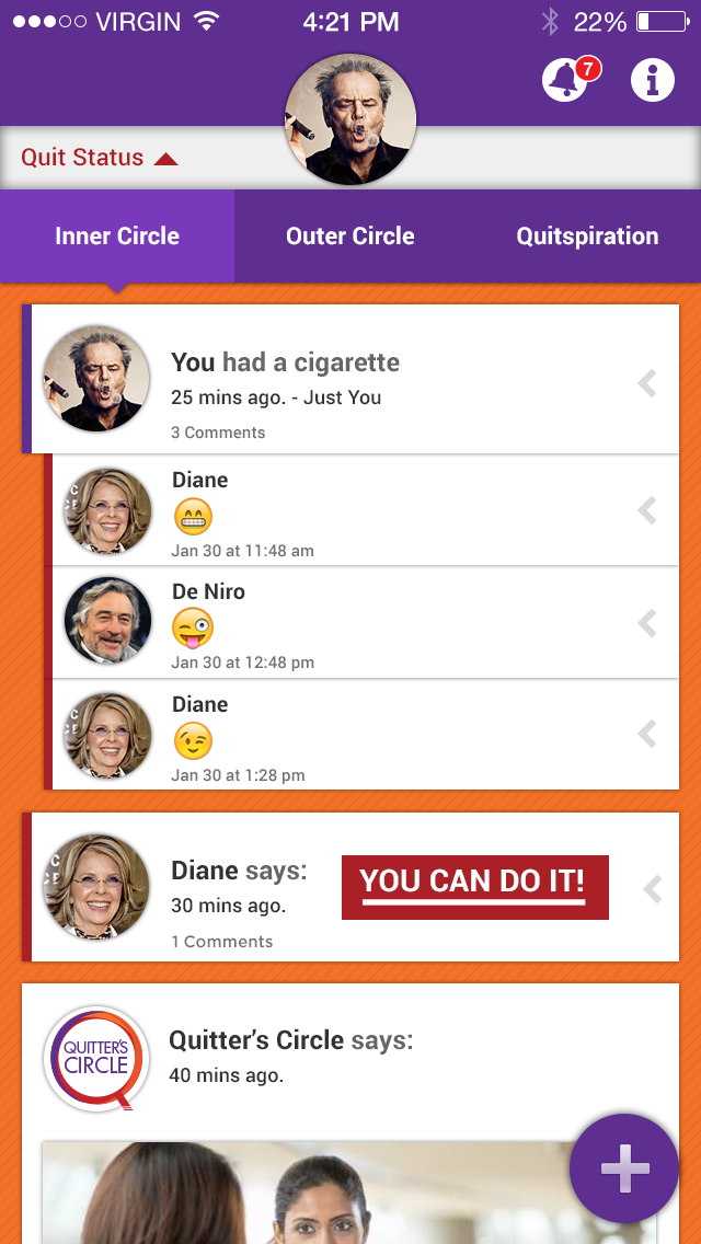
Calendar and mood tracker


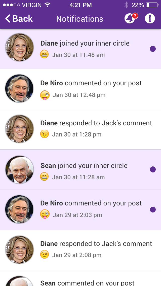
We encountered some typical legal challenges with these projects because we wanted to set up a system of notifications and messages but we weren't able to control what people would say and post. We thought of several solutions, from pre-written messages to just simple expressions.
After conversations with the stakeholders and the legal teams, we decided to move forward with an emoji and icons system that expressed the feeling and emotions of the users.
With this in mind, our copy team put together a matrix of messages and responses anticipating the reactions from the user.
Prototype
Conclusion
Since launching the new app in 2016, it has been downloaded more than 20,000 times and received excellent reviews and praise from the health community and especially from our clients.
The program that uses the app received:
Best Medical Digital Initiative for Consumers of 2016.
In addition, our process was so well received that our client now uses it as part of their framework for the development of their apps.
Pfizer follows up successful smoking cessation app with LivingWith, an app for cancer patients
"We can do surveys right in the app," Mark Pizzini, Pfizer's digital strategy lead, told MobiHealthNews.
"Fifty-seven percent of the people reported smoking less as a virtue of using the program. Sixty-four percent said they would recommend it to others. Those are two positive data points we’ve collected. Over 20,000 people downloaded the mobile app. There’s an online Facebook community of more than 170,000 people. All of this is very positive in the pharmaceutical space where the ability to do things like this is much more regulated and controlled."
